Case Study
UI UX
Project Overview
Donut Hole is an app to help people find a spot to meet that is convenient for all parties. Whether getting together for drinks, or finding a spot to meet up to carpool, it aims to make meeting in the middle a breeze.
Specific Problem
It's often a challenge to find a great spot to meet up, and I've been frustrated by the amount of time I've spent finding a good location that's in between a friend and I. I've scoured the internet and App Store thinking there must be something out there that is an easy solution to this problem, but most apps that having mapping capabilities are designed for a single person only. There are a few apps that aim to offer a similar (Findaspot, Geomidpoint, Tango), but their functionality is more limited than what I was hoping for, and may of them are poorly designed or outdated.
Initial Research
To solve this, I began thinking through this process with the friends I have shared this experience with and began brainstorming what would make a successful meet up app. I asked a handful of questions about their experiences planning a meet up with someone. The main takeaways from my research were:

Goals
After this initial data collection and brainstorming, I began creating a user flow and planned out what the desired user experience would be. These were my main goals, derived from the initial research:

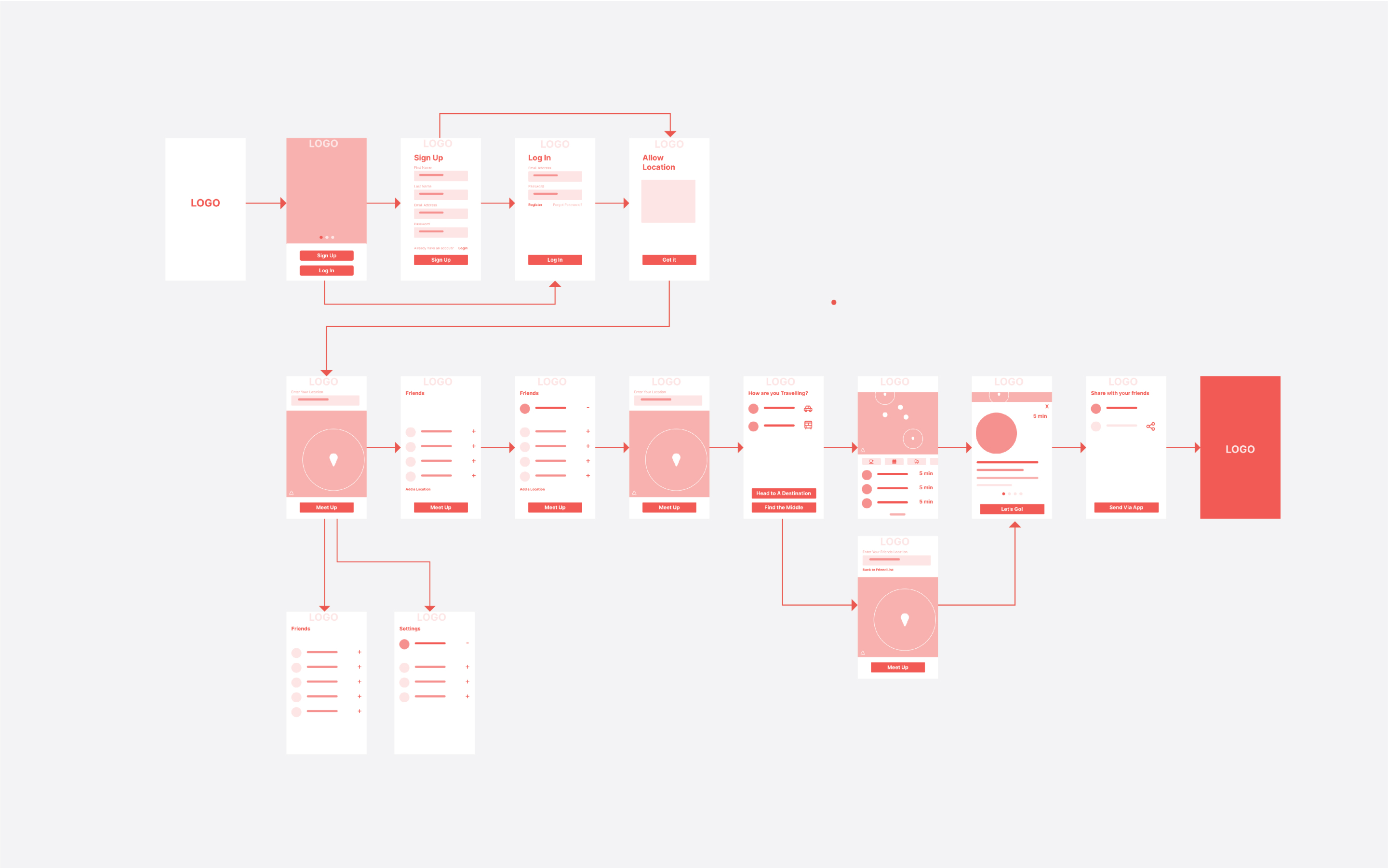
Initial Wirefame
After narrating a users journey through the app, I sketched out a site map; my intent was to create a seamless experience with an emphasis on simplicity. Finding a spot to meet up should be quick, fun, and easy, and I wanted the user experience of the app to reflect that.
User Testing
After user-testing the app with a handful of people, it was apparent that the flow could use some work. The initial home screen (with a map) was confusing. Initially I planned for a user to input their own starting location first, but that wasn’t clear. Also, it was suggested that it felt like too many steps were required. I looked at some other mapping apps for inspiration on how to navigate through a variety of options and improve the user flow.

Incorporating Feedback
I returned to my flow chart and remapped some of the user experience. While the mapping aspect of the app is crucial - the experience is more about meeting up with friends, so that became the starting point of the journey.

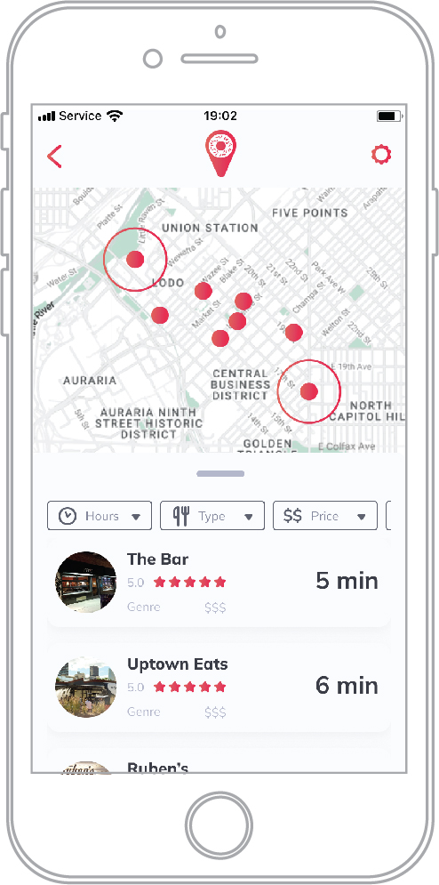
Initial Home Screen

Revised Home Screen
I also tightened up the number of perceived steps. By using filters selectable within each persons button, I eliminated four perceivable steps while still maintaining the same functionality.


Visuals
In creating the app, I noticed that many other apps that offered similar services were cluttered and dated. I wanted the visuals to reflect the easy-to-use and fun experience I am hoping to achieve.